Condensed geometric display font for branding
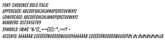
Chosence, designed by Situjuh Nazara, is a modern geometric sans-serif display font intended for high-impact visual projects. The font targets branding, logo work, social media graphics and technology-focused headlines by offering tall, condensed letterforms and stable stroke widths. It ships as a multi-style family and is provided in common install formats so designers and web developers can add it to desktop and mobile workflows with minimal fuss.
What does Chosence change about visual projects?
Chosence functions as a display typeface that emphasizes vertical space and mechanical geometry, aimed at headlines and brand marks rather than body copy. Its condensed proportions let designers place more characters in tight horizontal areas, which suits posters, social images, and logotypes that require compact, technical-looking text. The font's visual role is to prioritize presence and clarity in short, attention-grabbing typographic elements.
How much typographic control does the family provide?
The family includes six distinct styles, giving basic weight and slant options for hierarchy and emphasis. The design uses a uniform stroke width to keep contrast consistent across weights. The set contains roughly 221 glyphs, covering core Latin characters plus punctuation and diacritics, which supports standard headline typography without extended symbol or historic-script needs.
Is the font straightforward to install and use in design tools?
Chosence is distributed in OpenType and TrueType formats, the two formats most design apps accept; that simplifies installation in desktop graphics software and web font toolchains. Designers typically add the font to system font folders or load it inside layout applications. No specialized tooling or deep technical knowledge is necessary to begin using the family for headlines and branding prototypes.
Does it work across platforms and international projects?
The font is compatible with common desktop and mobile platforms that accept custom fonts, so files can be used on a variety of devices and in responsive workflows. Language support spans multiple Latin-based scripts and a selection of additional characters, which helps with international campaigns that stay within those scripts. For projects requiring extensive script coverage, test a sample layout before finalizing type choices.
Chosence is a practical choice for headline-focused design
Chosence suits designers who need a compact, technical display face for branding and headline work; its popularity on public repositories supports that role. Confirm commercial licensing with the developer before client deployment. For assignments that demand extensive script sets or small-size readability, preview the font in context to verify the glyph coverage and legibility meet project requirements.